Comprehensive brand identity system for Down Shift, an adventure motorcycle resort in Costa Rica.
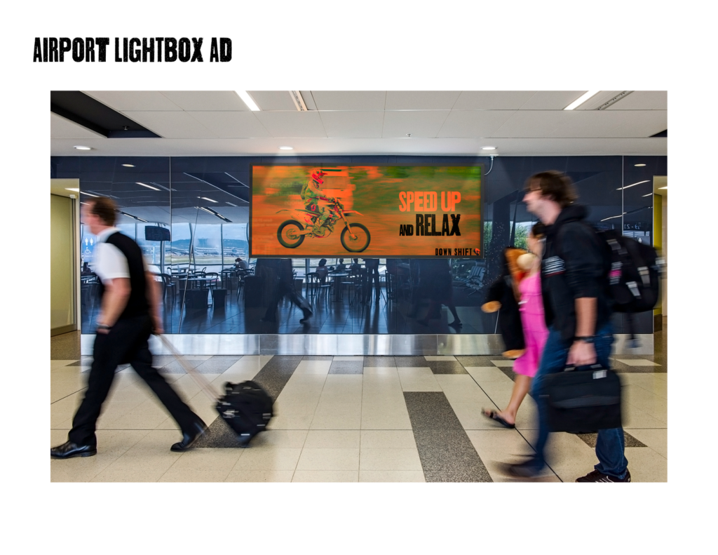
Down Shift is a wicked fun travel destination and experience for the motorcycle enthusiast who needs a break from the day-to-day. At Down Shift, guests can “speed up and relax,” pull the throttle and leave the desk job woes stateside.
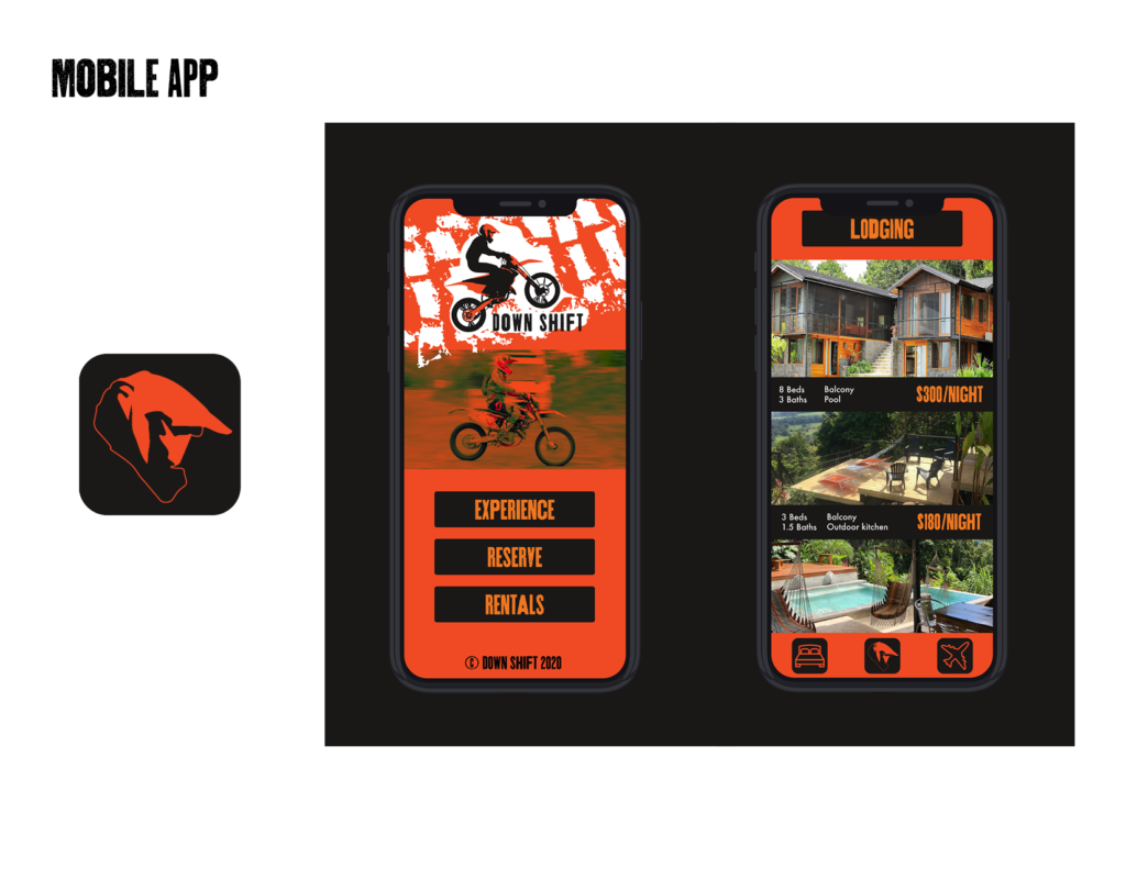
At the compound in Playa Hermosa, Costa Rica, guests can let go of their worries while taking professionally guided dirt bike tours on the beach, through the jungle, around waterfalls, and on our private motocross track. At the end of the day they can kick their feet up in a hammock overlooking the ocean.
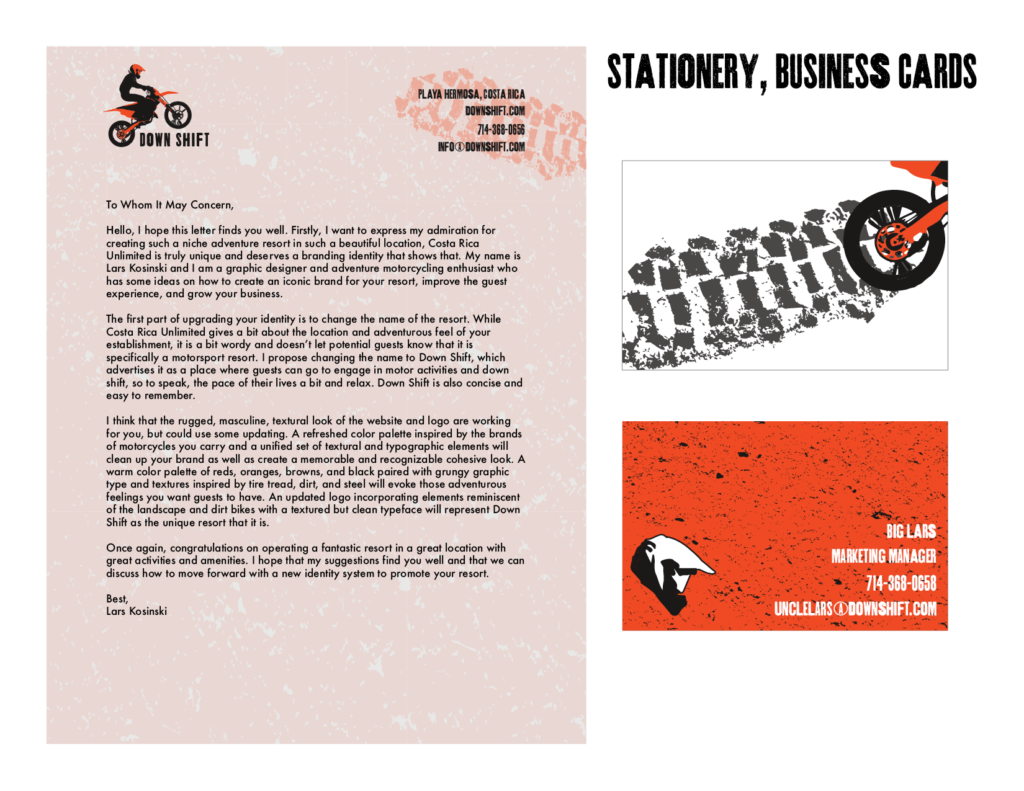
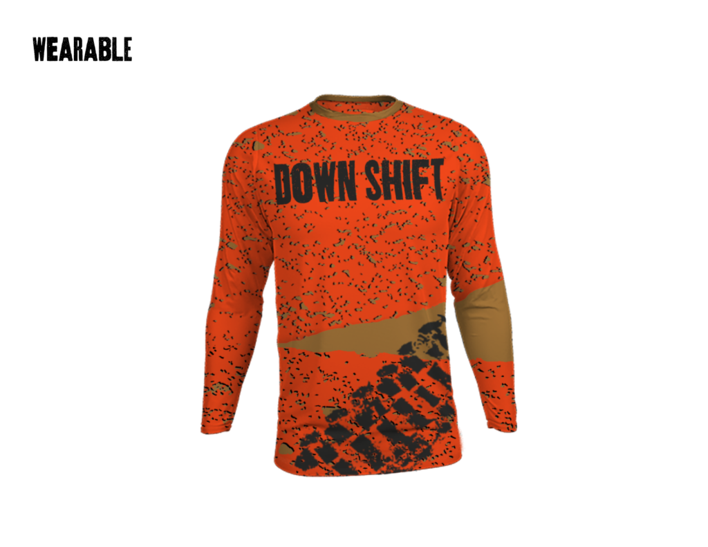
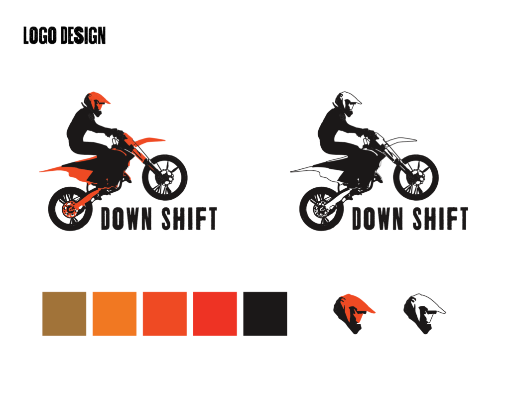
Down Shift’s brand identity uses bold, warm hues, rugged textures, and strong gritty typography. Taking care to avoid common tropes in tropical resort branding, sea foam green, coral, and sandy tan are left out of the brand’s color palette, making way for bold hues inspired by the brands of motorcycles available to ride at Down Shift. Design elements used throughout the identity system are dirt and tire tread textures, reflecting the off-road experiences to be had during your stay at Down Shift.
